Case Study
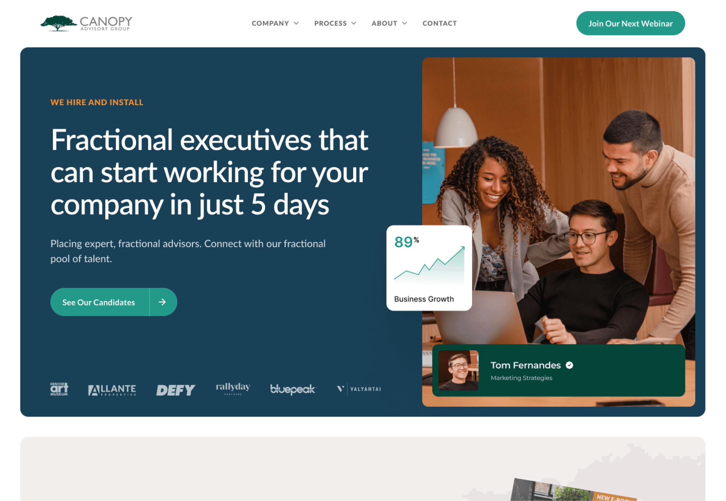
The Canopy Advisory Group's website with scientific design
Deddy I
Nov 5, 2024
Hey there! If you want people to buy, you have to ask. Great design makes next steps clear and obvious. Poor design leaves people confused. Today, I’ll walk you through my redesign of a fractional talent firm's landing page. You'll find 8 conversion-boosting design features at the bottom.
Let's dive in.
Before
I found 8 notable issues on CAG's website:
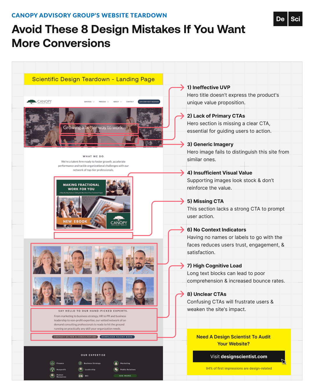
1) The first issue is an ineffective headline.
Hero title should express the product's unique value proposition.

2) Lack of Primary CTA.
The hero section should have a clear CTA to guide user action.

3) Generic Imagery.
Hero images should distinguish the site from similar ones.
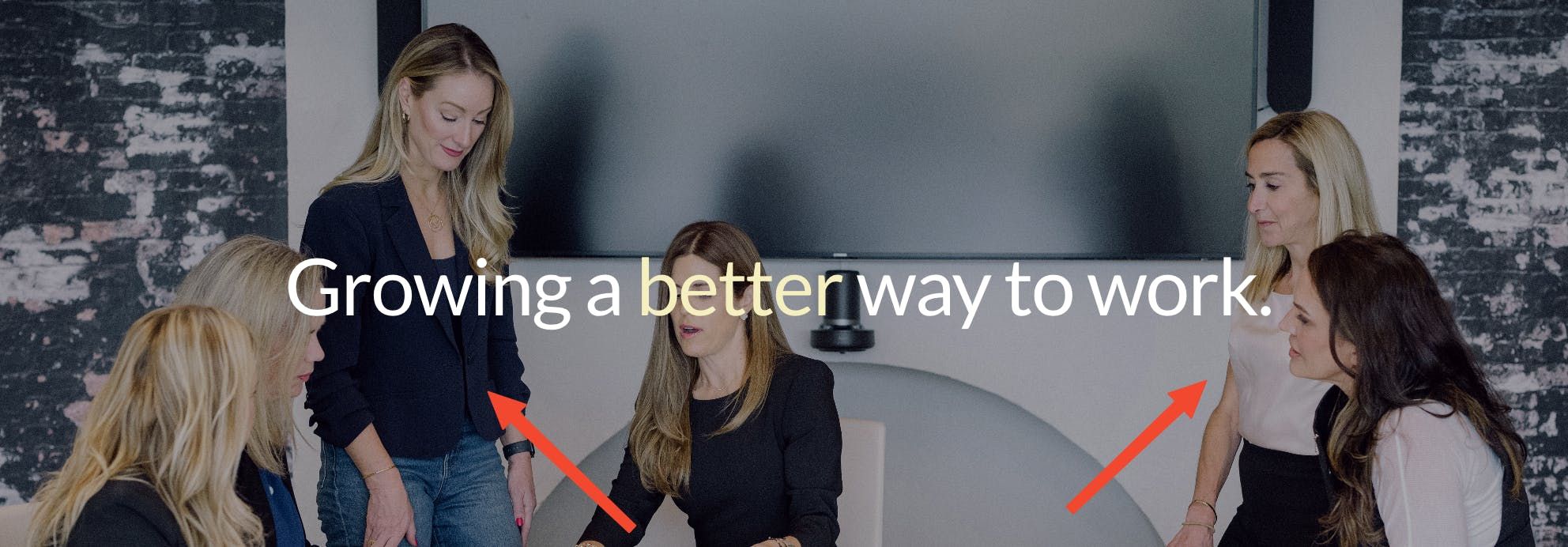
4) Insufficient Visual Value.
Supporting images should clarify & reinforce the value.
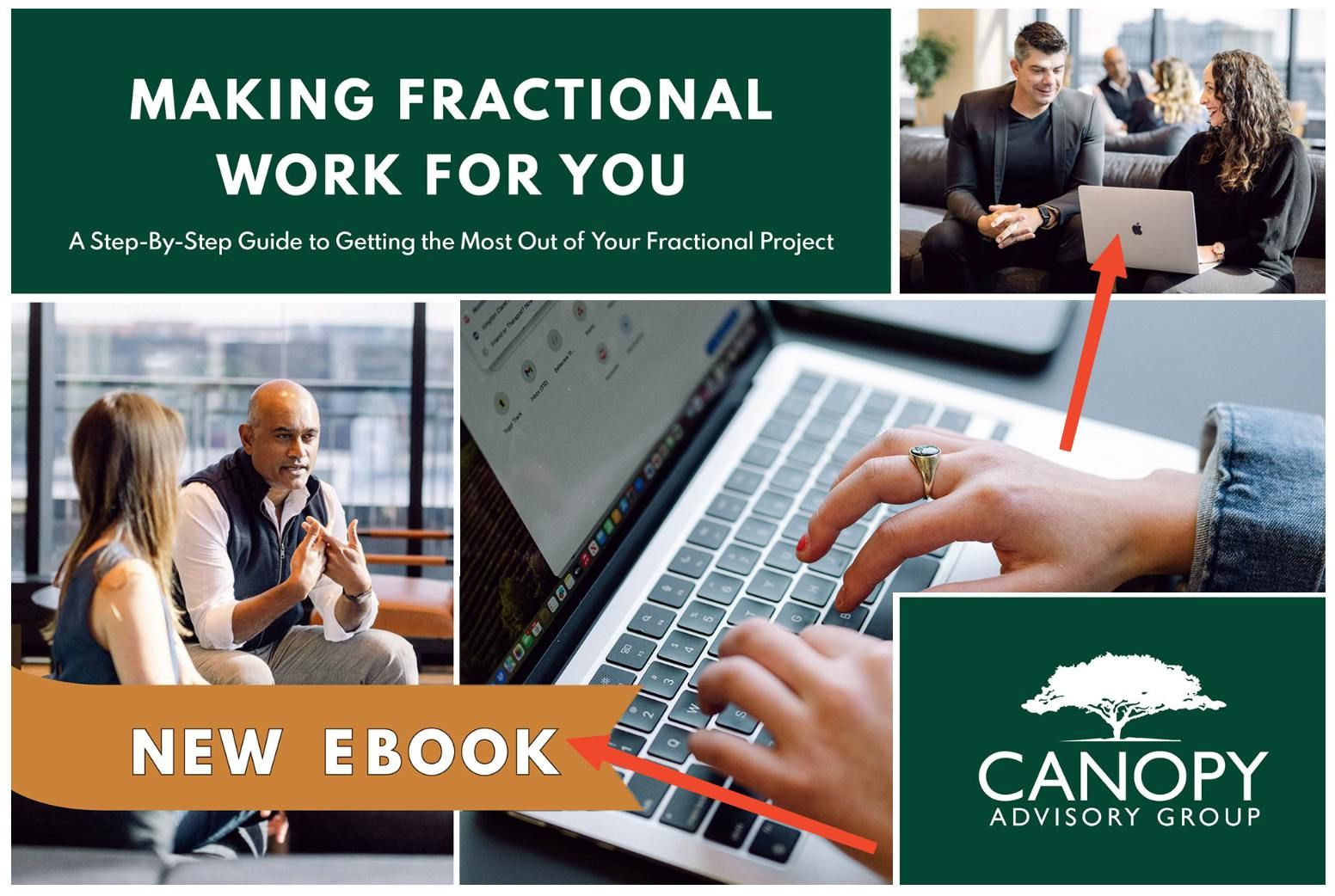
5) Missing Product CTA.
Highlighted products should have strong CTAs to prompt user action.
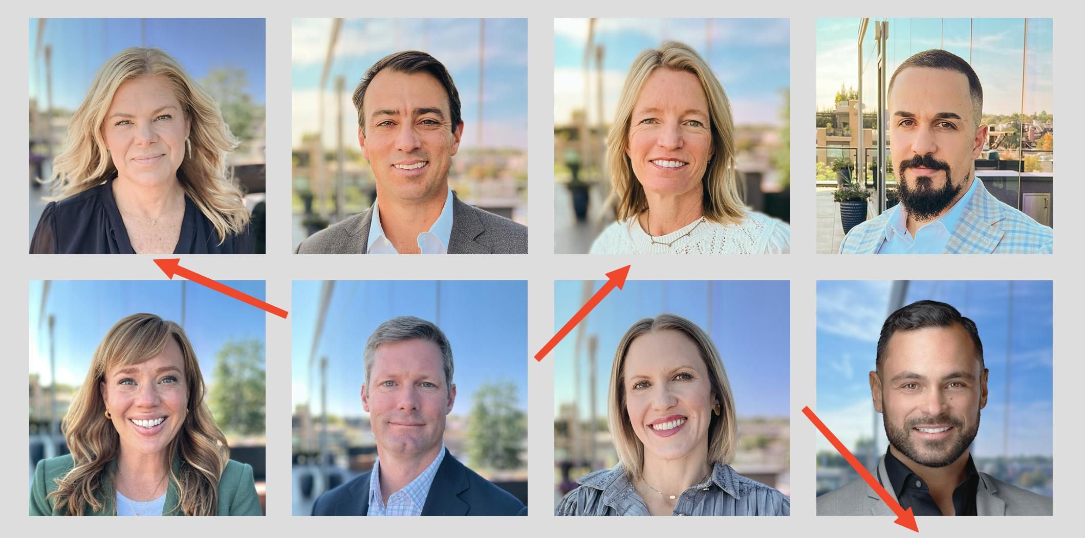
6) No Context Indicators.
Faces showcased together should have names or labels to provide context and increase trust.
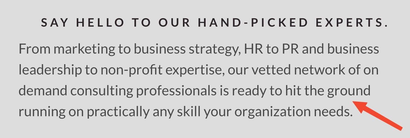
7) High Cognitive Load.
Text blocks should be concise & matched with visual elements.
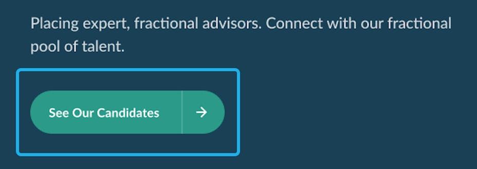
8) Unclear CTAs.
CTAs should strengthen the site’s impact by providing clear steps for users.

Redesigning
Now that we understand the issues, let's get to the fun part.
After
8 features of Canopy Advisory Group's website that work better redesigned:
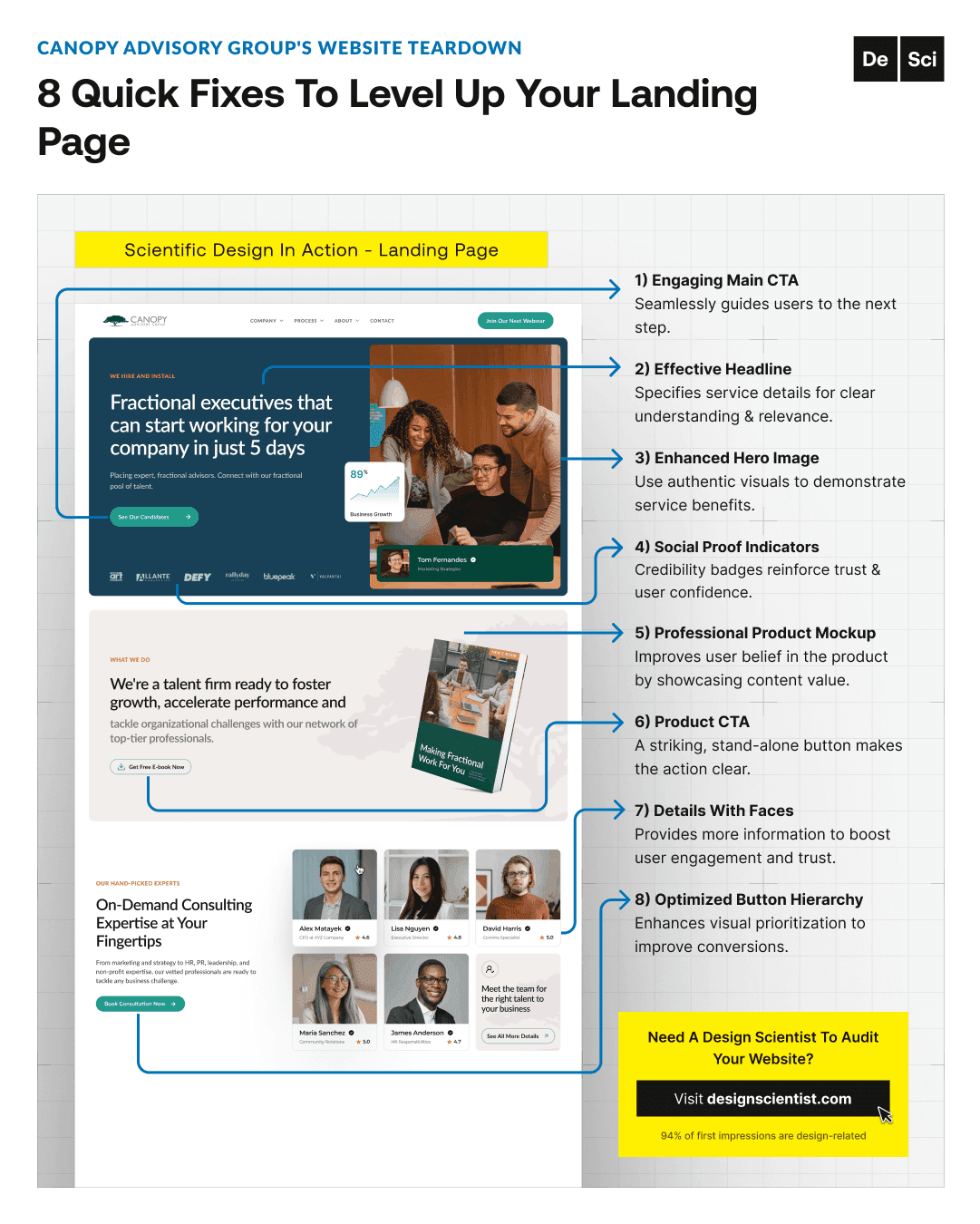
1) Engaging Main CTA
seamlessly guides users to the next step.
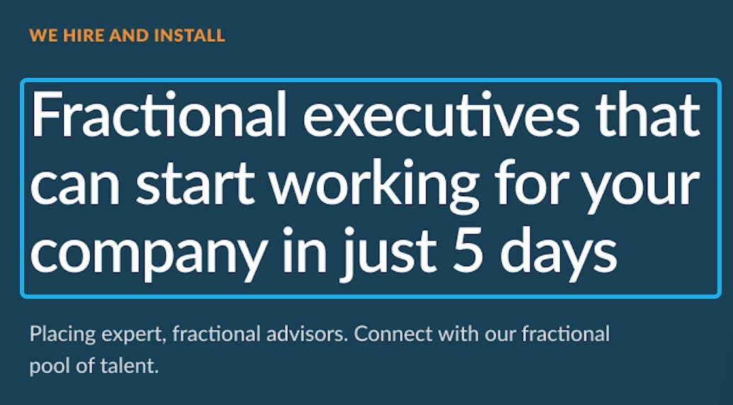
2) Effective Headline
specifies service details for clear understanding & relevance.
3) Enhanced Hero Image
demonstrates service benefits with authentic visuals.
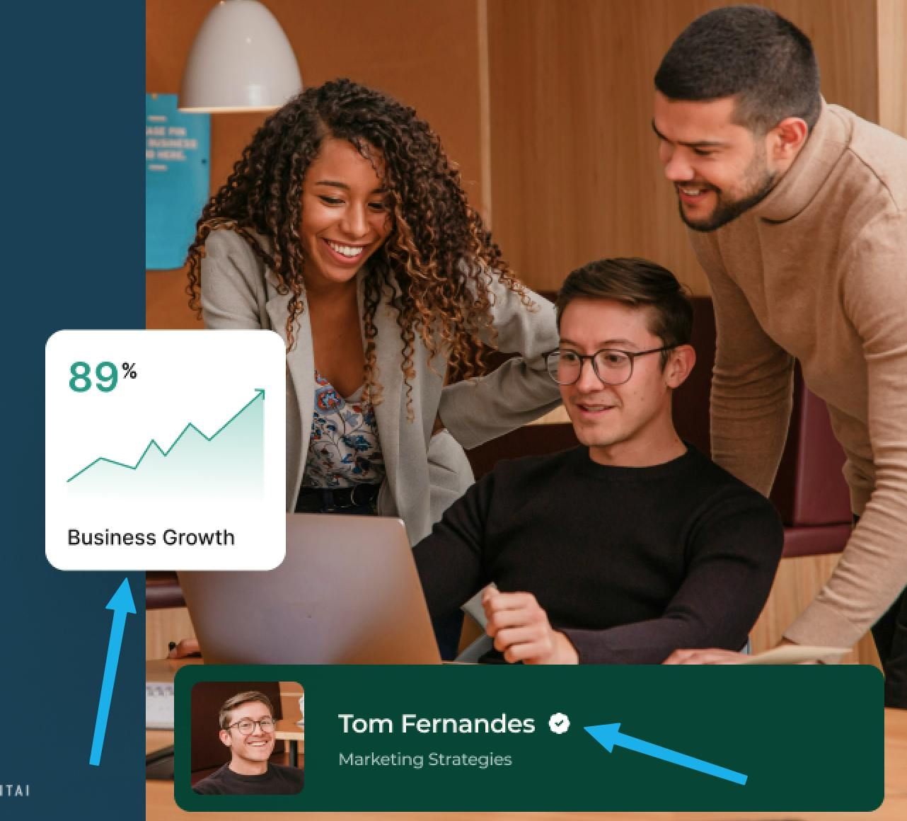
4) Social Proof Indicators
reinforce trust & user confidence.

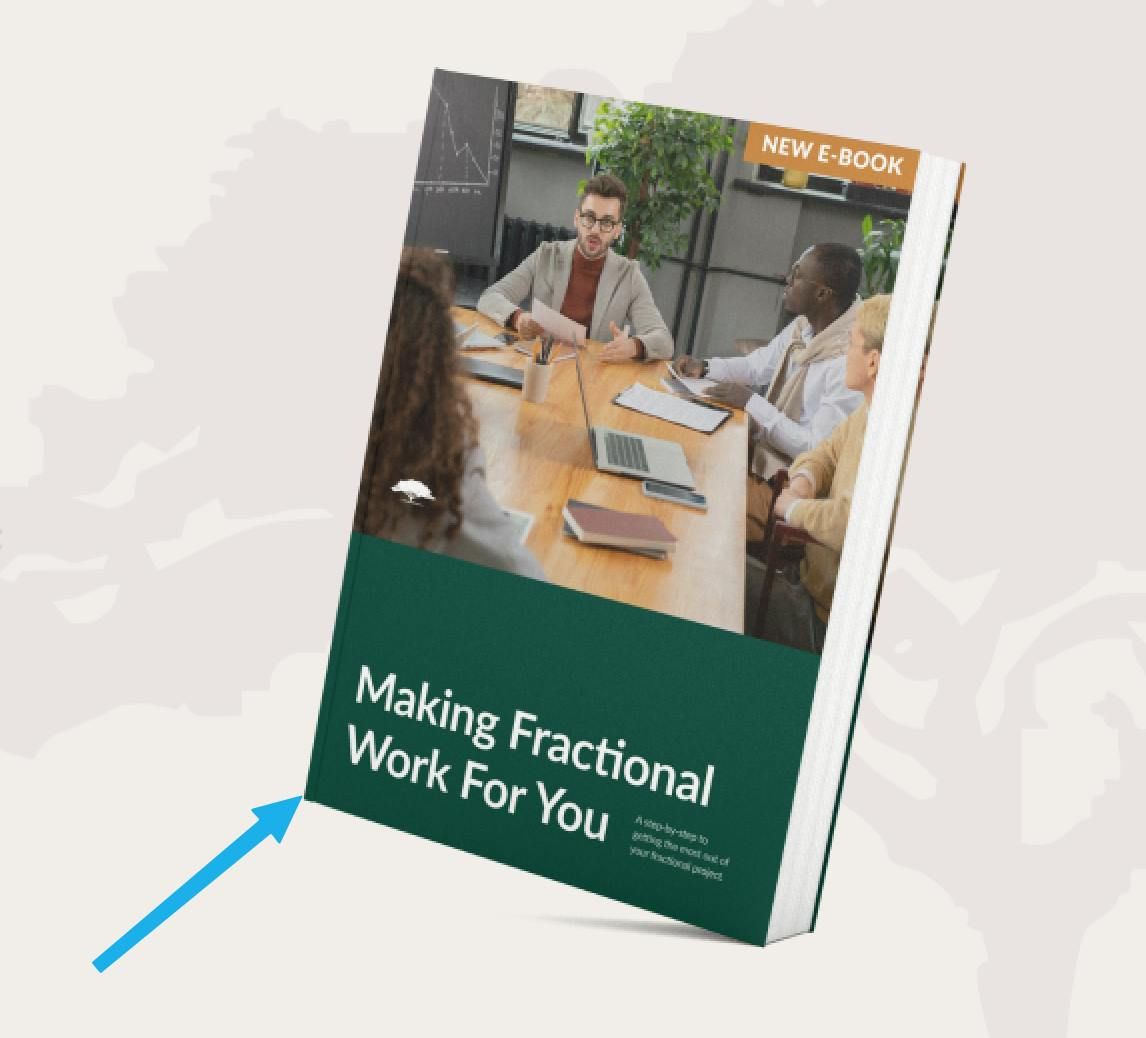
5) Professional Product Mockup
improves user belief in the product by showcasing content value.
6) Product CTA
makes the action clear with a striking, stand-alone button.

7) Details With Faces
provides more information to boost user engagement and trust.

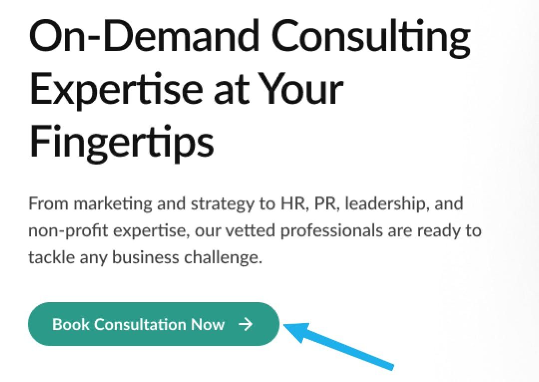
8) Optimized Button Hierarchy
enhances visual prioritization to improve conversions
TLDR —> 8 landing page design features that boost conversions:
Engaging main CTA
Effective Headline
Enhanced hero image
Social proof indicators
Professional product mockups
Stand-alone product CTA
Details with faces
Optimized button hierarchy
I hope these breakdowns are helpful. I'm here to help you see and understand effective design principles and practices. My goal is to inspire you (and your business) with the science of design. Design done different,
The Design Scientist
