Case Study
Breaking down Lynxguide's website with scientific design
Deddy I
Nov 6, 2024
Hey there! If you want users to trust your website, you have to prove it. Effective, thoughtful design plants a seed of believability. User confidence comes from showing more than you tell. Today, I’ll walk you through my redesign of a mass notification system's landing page. You'll find 7 trust-building design features at the bottom.
Let's dive in.
Before
I found 7 notable issues on Lynxguide's website:
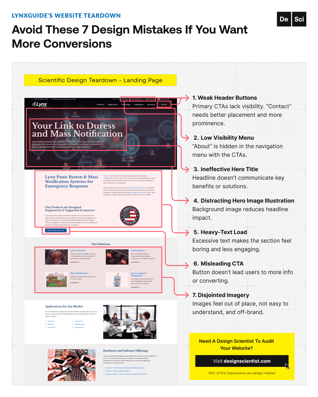
1) The first issue is the undifferentiated header buttons.
Primary CTAs should be visible, separate, & prominent.

2) Disconnected menus.
Navigation menus with CTAs should be separated from informational menus.

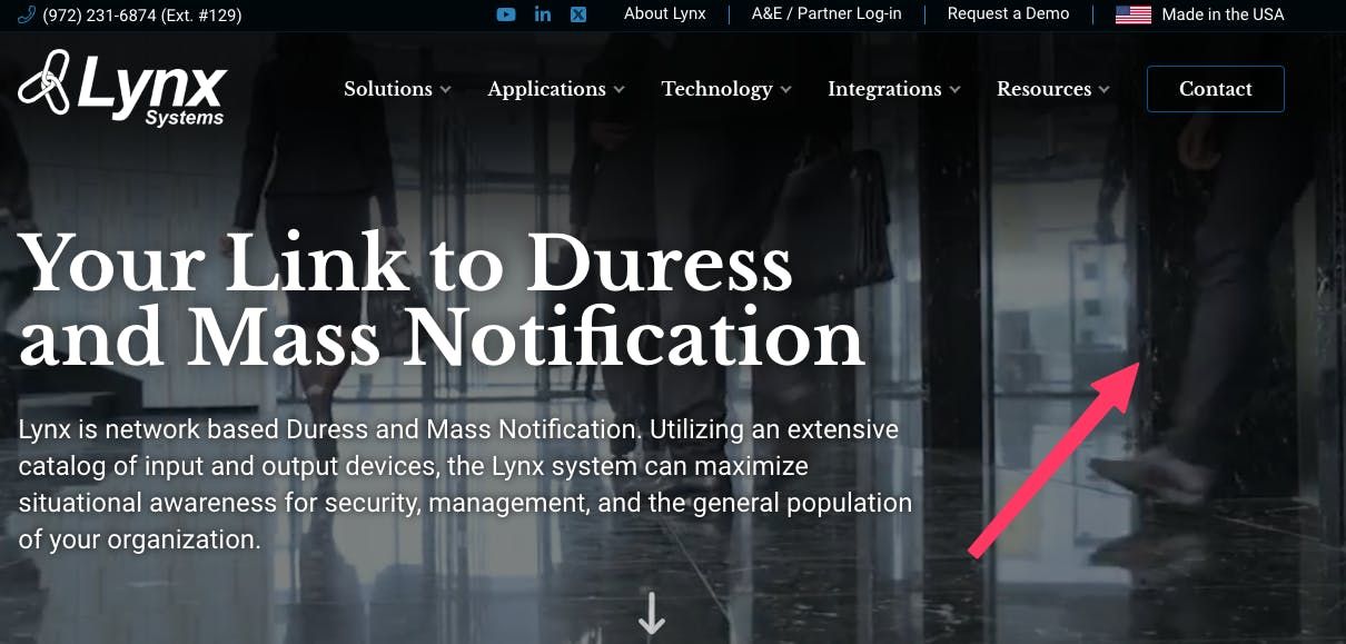
3) Ineffective hero title.
The headline should communicate at least one key benefit or solution.

4) Distracting videos in the hero section.
Background images/videos should reinforce headline impact, not take away from it.
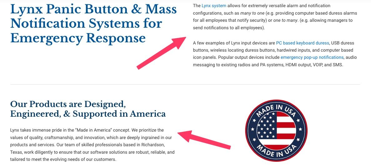
5) Dense text chunks.
Text should be organized in skimmable segments to make it more engaging.
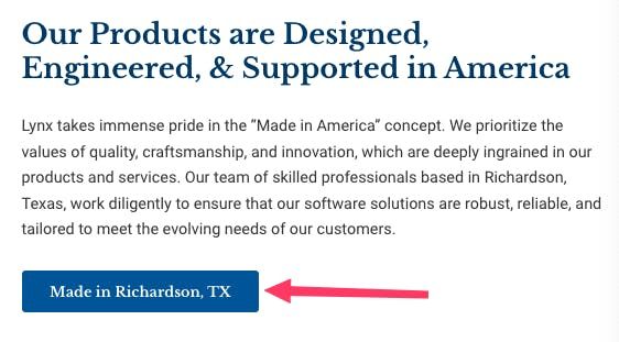
6) Misleading CTA.
Every button should lead users to closer conversion or more relevant information.
7) Disjointed, Generic Imagery.
Images should be easy to understand & fit the brand.

Redesigning
Now that we understand the issues, let's get to the fun part.
After
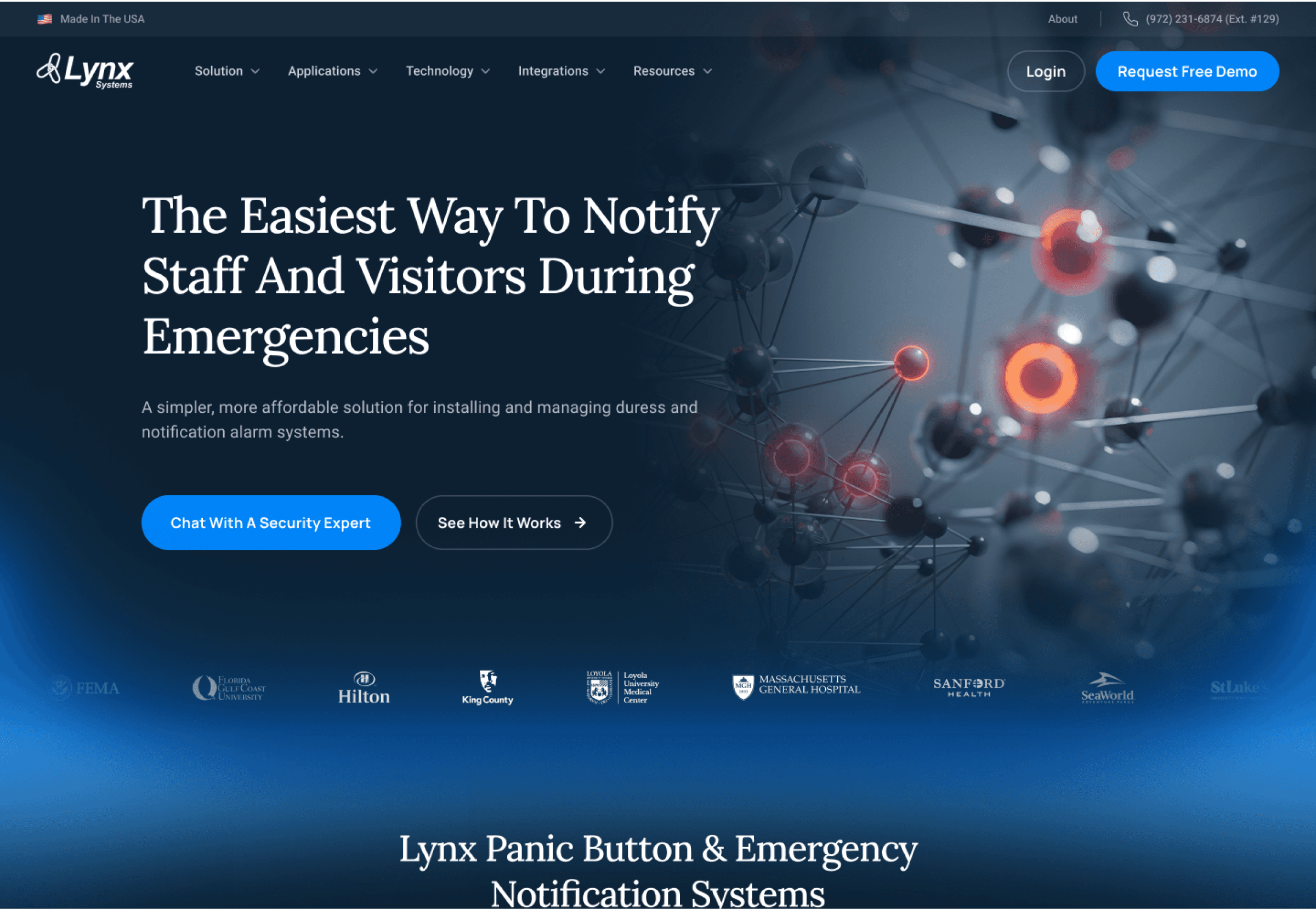
7 features of Lynxguide's website that work better redesigned:
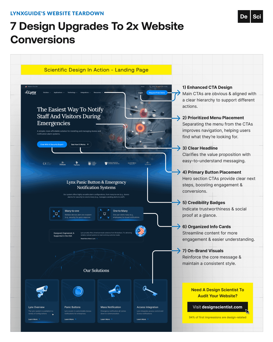
1) Enhanced CTA design
supports different actions with an obvious & aligned hierarchy.

2) Prioritized menu placement
improves navigation by separating the menu from the CTAs.

3) A clear headline
signals the value proposition with easy-to-understand messaging.

4) Primary button placement
boosts engagement & conversion with clear next steps.
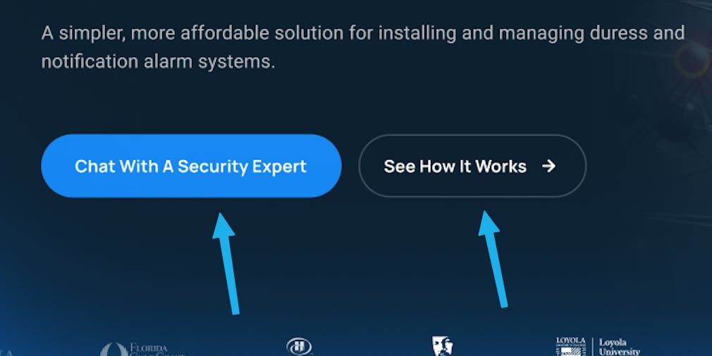
5) Credibility badges
indicate trustworthiness & social proof at a glance.

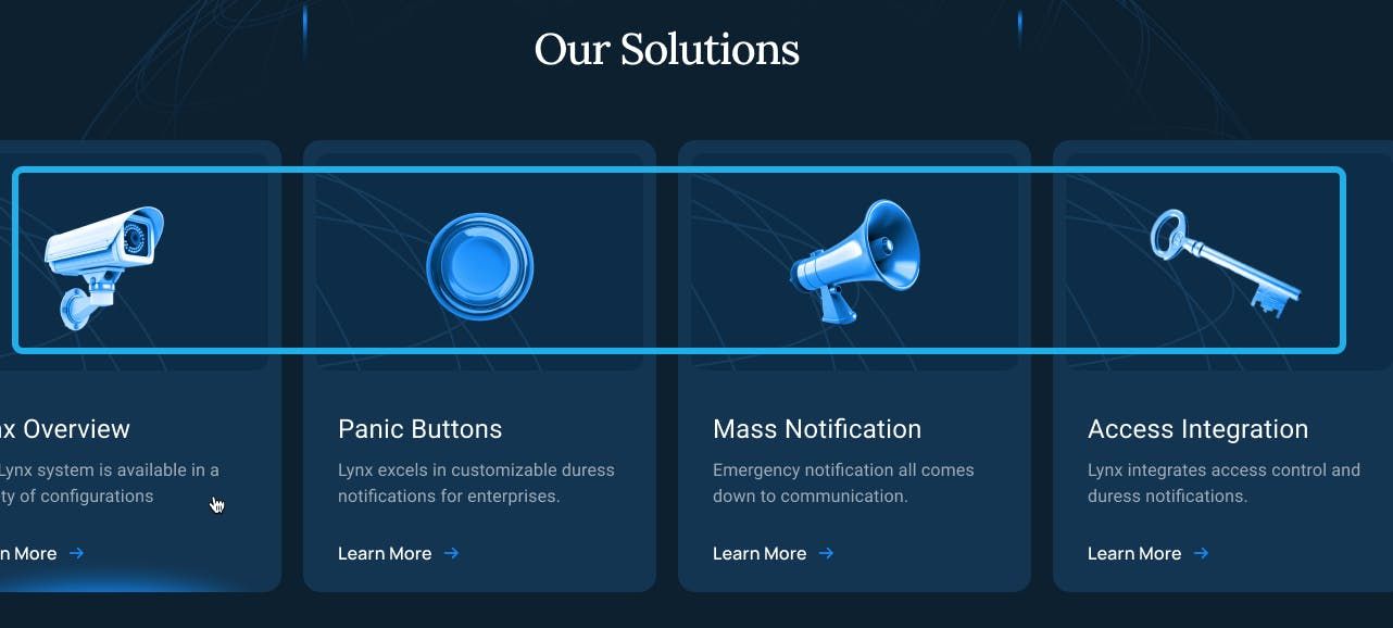
6) Organized info cards
streamline content for more engagement & easier understanding.

7) On-brand visuals
reinforce the core message & maintain a consistent style
TLDR —> 7 landing page design features that build trust:
Enhanced CTA design
Prioritized menu placement
Clear headline
Primary button placement
Credibility badges
Organized info cards
On-brand visuals
I hope these breakdowns are helpful. I'm here to help you see and understand effective design principles and practices. My goal is to inspire you (and your business) with the science of design. Design done different,
The Design Scientist
